UI/UX & The Chrome Inspector
Learn the ins-and-outs of how creating a great User Interface ultimately ties into an awesome overall User Experience. Learn how to use the Google Chrome Inspector to grab styles and adjust them on the fly!

What is UI?
UI, or User Interface, is ultimately the layout of the components that make up your application or website. Let's face it, people do tend to judge a book by it's cover. If your product is well-polished, then you're already ahead of the curve.
All of the page elements such as the buttons, graphics, forms, and other visual aspects are parts of the UI.
A great UI utilizes colors, whitespace, typography, and other page elements in a consistent and cohesive way.
What is UX?
Though the terms UI & UX are typically used interchangeably, UX is a different beast. User Experience, or UX for short, encompasses all aspects of how the end-user interacts with your website or application. It is the feeling a user has while using your app. Do the users get flustered trying to navigate the interface or are they able to quickly find what they're looking for? Whatever it may be, how the user feels about your design is what can make or break the success of your website or application.
A great UX understands the end-user, and keeps them in mind the entire time.
Why is UI/UX so important?
Attention spans nowadays are dwindling. Let's face it. No one has time to dig around your app or website. Users just want an intuitive and easy to use interface.
Have you ever visited a website or used some software that drove you mad? Trying to find that button to edit your profile, or trying to get some info that should be easy to find, but it's nearly impossible. It's maddening. A great UI/UX keeps the end-user in mind and places page elements where they should be, intuitively.
Your UI Should:
- Keep the end-users in mind
- Be intuitive & easy to use
- Be consistent
- Be able to take a complex information architecture and simplify it
- Use typography, color, and user elements to convey a consistent brand message
- Adhere to the visual hierarchy
- Focus on details and subtleties
The details you say? Adding things like subtle box-shadows, or a slight border-radius, a subtle animation or some other visual confirmation to your page elements can go a long way in enhancing the overall user experience.
Project Details
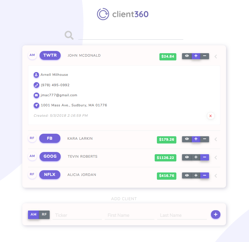
In this project we're going to be making a slightly more basic version of my teams CareerDevs Agile Week project, Client360, which is an app designed for financial consultants to keep tabs on their clients and their stocks. We'll be using HTML & CSS to learn how to use the Google Chrome Dev Tools Inspector.
We're going to learn how to borrow styles from other webpages.
Good artists copy; great artists steal. -Someone Famous
Open Client360 Here
View the Client360 Project on Github:
https://github.com/timwheelercom/agile-week
Follow the Client360 team on Github:
Tim Wheeler, Andres Flores, Funmi Olowookere, and Ben Laurent.
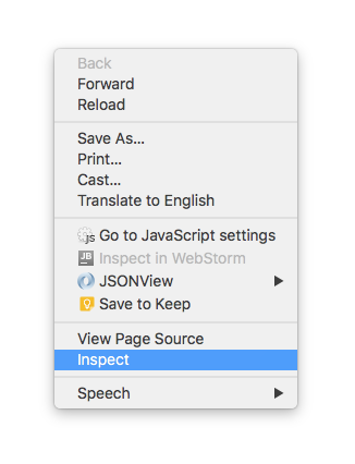
The Google Chrome Inspector
We're going to be using the inspector in the Google Chrome Dev Tools to play around with the styling of the Client360 project and add some of those elements to our project here. If you don't already have Google Chrome installed, please download it here.
The Inspector Allows Us To Edit Styles Right On The Screen
To use the Chrome inspector:
Right-click
Inspect
Setup Your Dev Environment
- Create a folder called
ui-tutorial - Within the
ui-tutorialdirectory, create 2 files,index.html&style.css - Open
index.htmland paste the project boilerplate below into your file.
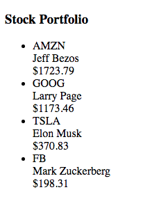
Project Boilerplate
<!DOCTYPE html>
<html>
<head>
<title>UI Tutorial</title>
</head>
<body>
<div class="container">
<ul id="client-list-ul">
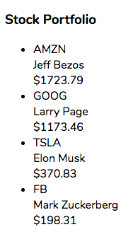
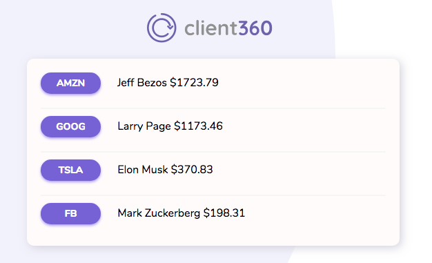
<li>
<div class="ticker">AMZN</div>
<div class="client">Jeff Bezos</div>
<div class="price">$1723.79</div>
</li>
<li>
<div class="ticker">GOOG</div>
<div class="client">Larry Page</div>
<div class="price">$1173.46</div>
</li>
<li>
<div class="ticker">TSLA</div>
<div class="client">Elon Musk</div>
<div class="price">$370.83</div>
</li>
<li>
<div class="ticker">FB</div>
<div class="client">Mark Zuckerberg</div>
<div class="price">$198.31</div>
</li>
</ul>
</div>
</body>
</html>
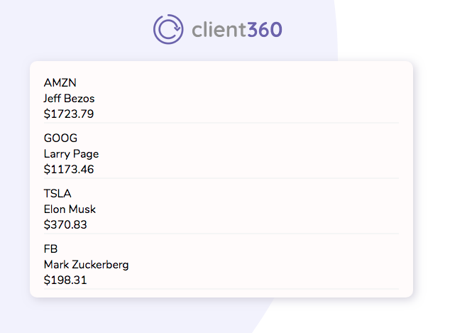
If all goes well, you should be able to run your file and see this:
Linking The External Stylesheet
Before we go much further, we can't forget to link our style.css stylesheet to our index.html file.
We can do this by adding this code snippet to the head of our index.html file, just below the title tag.
<link href="style.css" rel="stylesheet">
Ok, Let's Get Our Hands Dirty
Adding Fonts
A font can really pull together an entire project. Let's find out what the font is that Client360 is using.
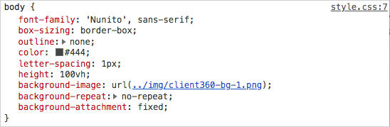
While on Client360, inspect the page, and let's do a little digging. With the inspector open, select the body element, and let's take a look at the styles over on the right.
You Should See Something Like This:
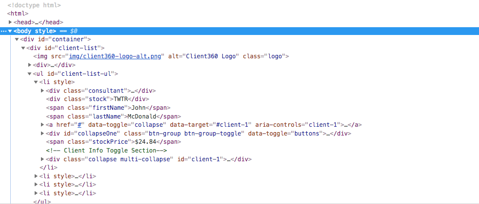
View The Styles Section On The Right:
It appears the font-family being used for this project is Nunito. Good news! Nunito just so happens to be a Google Font!
Tip: Google Fonts is a tremendous resource for web fonts. And it's free.
Goto fonts.google.com then...
- Search for the font
Nunito - Click the red plus button
- Expand the black bar at the bottom
You should see something like this:
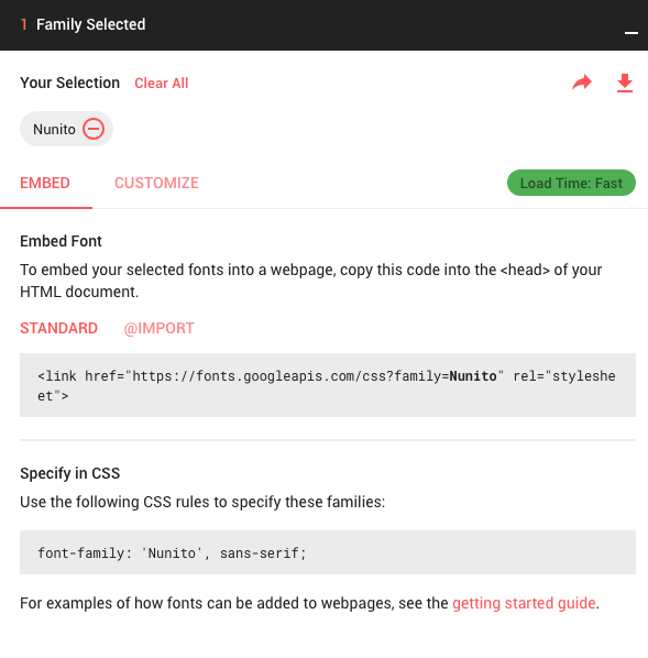
For us to utilize Nunito, we need to to add it to the head of our index.html file. We can place it below the link to our style.css file.
<link href="https://fonts.googleapis.com/css?family=Nunito:400,700" rel="stylesheet">
However, it's not enough to just link the font within the head, we also need to add the font within a CSS selector. Let's then reference the Nunito font-family and apply it to the body of the HTML document in our style.css file.
body{
    font-family: 'Nunito', sans-serif;
}
This essentially tells the browser that any code nested within the body tags should use the Nunito font, and if for some reason it's unavailable, let's fall back to the first available sans-serif font.
Woah.
Now our page looks like this:
Let's Start Inspecting Some More
When we first inspected our body element, there was actually a few more styles to it. Let's add them.
Add The Rest Of The body Styles To style.css
body {
    font-family: 'Nunito', sans-serif;
    background-color: #f5f5f5;
    height: 100vh;
    background: url("http://bit.ly/ui-bg");
    background-repeat: no-repeat;
    background-attachment: fixed;
}
Note that the background has been replaced with a link to an external file from bit.ly, rather than the local file shown on the Client360 page.
Inspect The Container Element
As you could guess, the .container element is what contains the entire project; the background, the app, and everything else on the page. The CSS for the Client360 .container element should look something like this.
Let's make a small edit. Change the max-width property to 500px instead of 800px.
.container {
    width: 90%;
    max-width: 500px;
    margin: 20px auto;
}
Now add this code snippet to your style.css file.
Let's Add The Client360 Logo
If we inspect the Client360 logo, we'll notice that there's an aptly named class of .logo applied to the img tag. The logo is actually setup in a local directory of the project, as it should be. To make everyone's lives easier, you can link to the image here: http://bit.ly/ui-logo.
Your img tag should now look like this:
<img src="http://bit.ly/ui-logo" alt="Client360 Logo" class="logo">
Go ahead and add this img element to your index.html file, just below the divwith the class of .container.
Next, let's create the selector for the .logo class in your style.css file like so:
.logo {
    width: 200px;
    height: auto;
    display: block;
    margin: 0 auto;
}
On To The ul Element
The ul is essentially where all of the content lives inside of our project. Let's use the inspector to see what's going on under the hood.
Find the Client360 ul with an id of client-list-ul. It's styles should look something like this:
#client-list-ul{
    min-width: 500px;
    background-color: #fffbfb;
    padding: 20px 20px 5px;
    margin: 20px 10px;
    border-radius: 10px;
    box-shadow: 3px 3px 20px #d3d1dd;
}
We just need to make a quick adjustment:
Change min-width: 500px; to max-width: 500px;. Let's add it to our style.css file.
If you've followed along thus far, your app should be starting to take shape.
Let's Experiment Some More
Remember where I mentioned that the inspector allows us to edit styles right on the page? Let's give it a shot.
In the inspector, let's select the #client-list-ul element again. Over to the left in the styles section, take a look at the box-shadow property. You'll notice a little box-shadow thingy. Click on it.
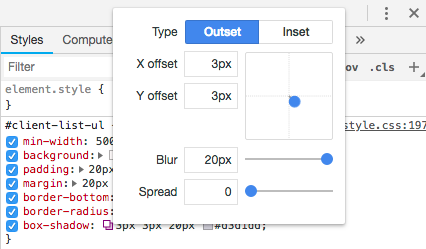
You can adjust the values and watch the changes happen right on the screen. All without messing anything up. If you don't like the way it looks - no worries. These values don't save. Just make sure that you copy the CSS properties and values that you do want to keep so that you can paste them into your style.css file.
Try messing with the other values. Adjust the border-radius, or padding. Change the background-color even. You can also add new CSS properties. In fact, add this property to the #client-list-ul element in your inspector:
display: none;
Oh No. What Happened?
As you might've imagined, display: none took the selected element, in this case, the #client-list-ul and made sure it was no longer displayed.
No worries, though.
Simply refresh the page to go back to the original version.
We're Getting There
It looks like the next elements we'd need to style would be the li's within the #client-list-ul.
If we look at the Client360 project, and we inspect the first li within the #client-list-ul it has a style of:
#client-list-ul li {
    margin-bottom: 10px;
    padding-bottom: 20px;
    border-bottom: 2px solid #f5f5f5;
    list-style: none;
}
Let's add this to our style.css file and see what happens.
Hmmm...for some reason there's a border on the last li element, which looks kind of weird.
Any ideas as to how we can get rid of it?
Hint: Inspect the last li on the original Client360 project and see if there's anything that's different.
It looks like there's a pseudo-class that's selecting only the last li.
#client-list-ul li:last-child {
    border-bottom: none;
}
Go ahead and add this to your style.css file.
Ahhh, much better.
Now that we've gotten rid of the border on the last li, let's see what else is left.
The Client Fields
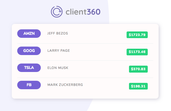
At this point, our project is starting to look a bit more like the original Client360.
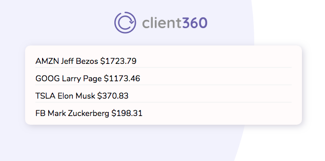
Right now the stock ticker, the client name, and the stock price are all stacked on top of one another. How can we get them side by side?
Head over to your project, open up the inspector, and click the '+' button on the top right of the dev tools. Then you'll want to select the li's and all of the div's that are within them. Then set them to display: inline-block like so:
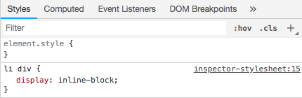
Notice how it moved all of the client info side by side? Just don't forget to add this to your style.css file.
li div{
    display: inline-block;
}
Sweet, now everything's inline.
The Home Stretch
We're almost there. Looking at our project, it seems we only have a small handful of items left.
We just need to add some styling to the .ticker, .client, and .price classes and we should be ready to rock & roll.
Let's inspect how the Client360 app styled it's stock tickers:
.stock{
    background: #7360db;
    padding: 2px 10px;
    padding: 6px;
    border-radius: 30px;
    font-weight: 700;
    color: #fff;
    width: fit-content;
    min-width: 75px;
    display: inline-block;
    text-align: center;
    margin-right: 20px;
    font-size: 14px;
    box-shadow: 0px 2px 5px #ac9dff;
}
Hint: Notice that Client360 used the class .stock instead of .ticker. Make sure to address this properly in your style.css file.
Adjust the .stock selector accordingly then add it to your style.css file.
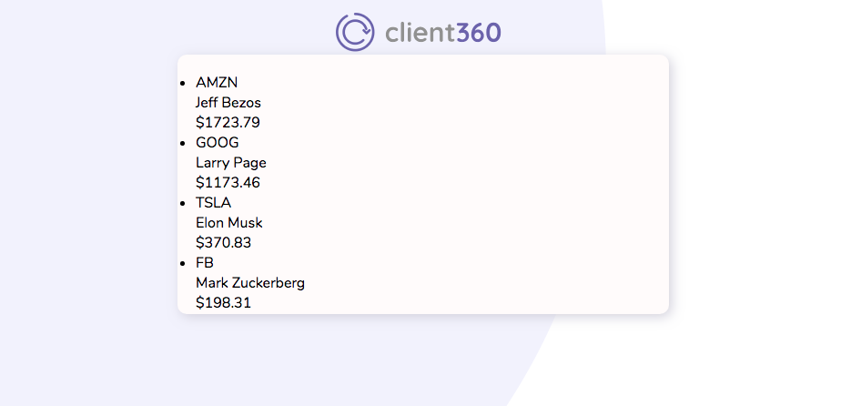
Your project should look like this at this point:
Sweet. Now it's coming together.
If you're project doesn't quite resemble the screenshot above, go back a few steps to see if you might've missed any important details.
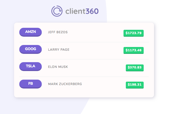
Let's style the client's name
When we inspect the client's name on Client360, it appears the same style is being added to the first name, last name, and stock price.
In our project, we just have .client and .price classes which will be fine.
.firstName, .lastName, .stockPrice {
    text-transform: uppercase;
    letter-spacing: 1px;
    color: #777;
    font-size: 12px;
}
Hint: Just like you did for the .ticker class, adjust the CSS selector above to only select the .client and .price classes.
Add this to your style.css file.
Last But Not Least
Let's take a peek at the styling for the stock price on Client360.
.stockPrice {
    margin-left: 50px;
    color: #fff !important;
    font-weight: 700;
    background: #45d372;
    padding: 4px 8px;
    border-radius: 4px;
    float: right;
    margin-right: 20px;
    margin-top: 8px;
}
Hint: Don't forget to check the class name.
You guessed it. Go ahead and adjust the class name then add this to your style.css file.
Awesome, your project looks great!
But Wait, There's More
Remeber how I mentioned the details? Well, the details are what makes your end-users feel all warm and fuzzy on the inside. And they don't have to be over the top, either.
Add A Favicon To Your Project
A favicon is that little icon that shows up on your browser tabs. Add this code snippet to the head of your index.html file.
<link rel=icon href="https://bit.ly/ui-favicon" sizes="16x16" type="image/png">
Let's add some style to the stock tickers
Go to your style.css file and add this to your .ticker selector:
border-bottom: 4px solid #6353b9;
Let's spice up the stock prices
In the style.css file add this to your .price selector:
    border-bottom: 2px solid #33a758;
    transition: box-shadow .5s ease;
Next, let's add a new pseudo-class selector that comes in to play when a user hovers over the .price element.
.price:hover{
    border-bottom: 2px solid #33a758;
    box-shadow: 3px 7px 15px #ddd;
    transition: box-shadow .5s ease;
}
Let's Get Animated
There's all kinds of css libraries that you can use on your project that can really change the entire dynamic of your project.
Two of my favorite libraries are:
Let's install a CDN for the Hover.css library.
Add this snippet to the head of your index.html file:
<link rel="stylesheet" href="https://cdnjs.cloudflare.com/ajax/libs/hover.css/2.3.1/css/hover-min.css">
Lastly, in your index.html file, add a new class called hvr-floatto each of your .ticker elements like so:
<div class="ticker hvr-float">AMZN</div>
You Made It!
You've learned the basics of UI/UX, including how to use the Google Chrome Dev Tools Inspector to view, edit and remove CSS styles on the fly, how to add web fonts, and even how to animate some page elements.
View The Source Code
https://github.com/timwheelercom/ui-tutorial
If you liked this tutorial please subscribe below!
Help us improve our content